Charts
FastReport can insert charts into a report. The TfrxChartObject  object from the FastReport component palette in Delphi is used for this purpose.
The component is based on the “TeeChart” library which is included in Delphi distribution kit. Alternatively the “TeeChartPro” library can be purchased separately.
Let's make an example report with a simple chart. The chart will use the “Country” table from the DBDEMOS database that comes with Delphi . The table contains data about countries, their areas and populations:
Name            Area        Population
Argentina       2777815     32300003
Bolivia         1098575     7300000
...
Create a new project in Delphi. Place TTable, TfrxDBDataSet, TfrxChart and TfrxReport components on the form and set these properties:
Table1:
DatabaseName = 'DBDEMOS'
TableName = 'country.db'

frxDBDataSet1:
DataSet = Table1
UserName = 'Country'
Open the report designer, create a new report and connect the data source in the “Report > Data…” dialogue. Add a “Chart” object  to the report design page and set its size to 18 cm wide x 8 cm high. Open its object editor by double-clicking on it.
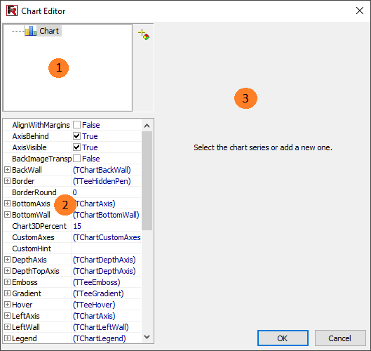
Key to the chart editor above:
1 – chart structure; a chart can contain one or more series
2 – object inspector showing the properties of the element selected in the window; set the chart properties here
3 – options area for connection of the series to data; it is activated once a series in area 1 has been selected
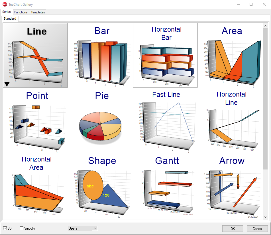
When first opened the chart editor will appear as in the image shown above. The first task is to add one or more series to the chart (just one series in our example). Do this by clicking the add button  and selecting the pie chart in the Gallery:
The vertical arrows change the order of the series in the list. To change the name of a series select the series, then one second later click on it again (note that this is not a double-click).
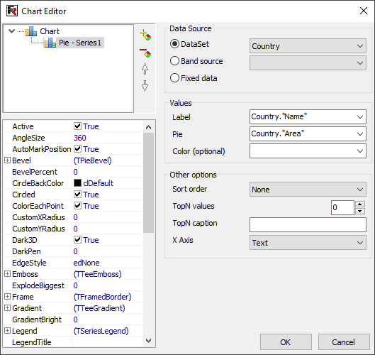
There are many different types of series available. After a series has been added the options area 3 becomes active. Here you specify which data should be used for plotting the chart.
First let's choose the dataset in the “DataSet” drop-down list. Then choose the “Label” and “Pie” fields using their respective drop-down lists, as shown below:
Click OK to close the editor and preview the report:
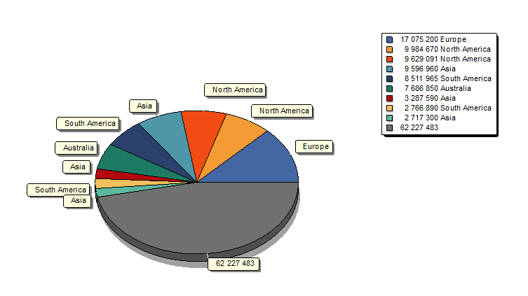
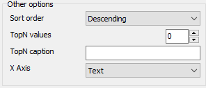
What can be improved in this report? It would be nice to sort the populations in descending order. Open the chart editor again, select the series in the chart structure and change the sort order from "None" to "Descending":
If we previewed the report now, we would see that the data in the legend table has been sorted in descending order.