Using interactive maps in FastReport VCL 2021
This is the final article of the courses of Akademik educational program. In the previous publications, we considered building reports with dialog boxes and connecting a report to the Fast Report data.
The Map Object is used to display two-dimensional graphic maps in ESRI shapefile (.shp), Open Street Map (.osm), and GPS-track (GPS Exchange File, .gpx) formats.
http://en.wikipedia.org/wiki/Shapefile
https://en.wikipedia.org/wiki/OpenStreetMap
https://en.wikipedia.org/wiki/GPX
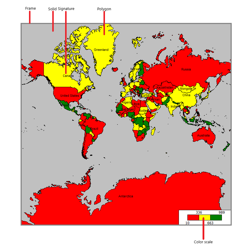
The Map object consists of the following elements:
One Map object may display one or several layers. Each layer contains a separate map.
In the designer mode and in the window for viewing the ready report, you can manage the map display with a mouse:
- a mouse scroll changes a map scale;
- by clicking the left mouse button, one can move a map;
- by clicking inside a polygon, one can set its properties in the object inspector.
The minimal and maximal scaling values are set in MinZoom and MaxZoom properties. These values can be set in the object inspector.
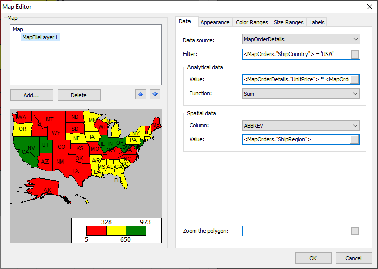
The Map object has a lot of settings which can be changed in the object editor. For that, double click the object or choose “Edit…” in its dropdown menu:
Adding layers
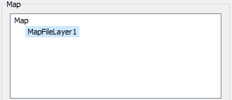
The Map object may contain one or several layers. The list of layers is displayed in the upper left corner of the editor:
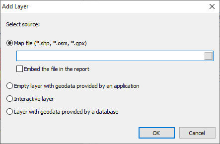
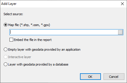
To add a new layer, click “Add…”. The following window will appear:
At this step, a layer type should be chosen:
- a map from a file (.shp/.dbf, .osm, .gpx). This is the most frequently used type of maps. For example, you can print a world map and highlight the countries in which sales were higher than a certain value;
- cartographic data from an application. Your application must provide geographical coordinates (a pair of values – a latitude and a longitude), which will be displayed as a point on the map. The points may have inscriptions and be of various sizes and/or color, depending on certain data. In practice, this map type is used as the second layer (the first, basic, layer is taken from a map file). For example, the basic layer displays a map of a certain country, and the second layer displays points with the name of cites in which there were sales. The sizes and colors of the points can be set so that the level of sales in that city is apparent.
If you choose a layer based on a map file, indicate additionally how the cartographic data will be stored:
- data are embedded into the report file. At that, the report may significantly increase in size;
- the report file refers to the map file without embedment. This mode is useful if you have several reports using the same maps.
It is important to note that large maps (over 30 Mb) or maps with a large number of polygons (over 20,000) will significantly slow down the report execution.
Setting the appearance
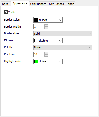
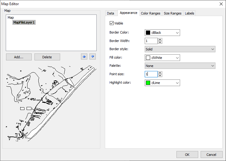
To do that, switch to the Appearance tab and choose the necessary layer:
Here you can set the color and style of the frame of the map polygons, as well as choose the color palette. If you set highlighting polygons with color depending on the analytical data (will be described below), then the palette will be ignored.
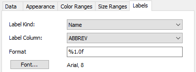
The map may show inscriptions, for example, country names in the world map. You can set the type and appearance of the inscriptions in the Labels tab:
If you choose a map from the .shp file as the layer type, it is necessary to indicate the field from which the inscription will be taken. As a rule, this is the NAME field. For the world map included into the FastReport demo, one may choose from the following fields:
- NAME (for example, Russia)
- ABBREV (for example, Rus.)
- ISO_A2 (for example, RU)
- ISO_A3 (for example, RUS)
The list of fields will be different for other maps.
Connecting to data
Most of the reports use the Map object not as it is, but to display analytical information. For example, it can be sales in different countries. For that, a layer should be connected to the data. This can be done in the map editor by choosing a layer and switching to the Data tab. Connecting to data differs depending on the layer type (from the map file or geodata from the application):
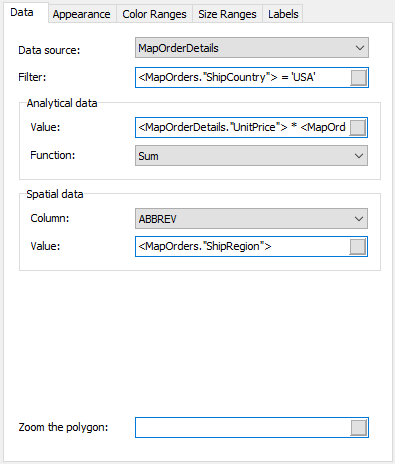
- if the layer type is indicated as a map from a file, the Data tab looks like this:
In that case, the application must display the following data:
- name (for example, country name);
- numerical value (for example, sales in a given country).
Let us have a Sales table with the following fields and data:
Country Sales Total
------- ----------
USA 500000
Germany 1200000
Russia 300000
In that case, the data should be set in the following way:
- data source – Sales
- spatial data, column – select the field which corresponds to the country name in the map file. As a rule, this is the “NAME” field.
- spatial data, value – [Sales. Country]
- analytical data, value – [Sales.SalesTotal]
- analytical data, function – “Sum”. This function is used if there are several inscriptions with different values for a given country.
The “Scale up polygon” field allows scaling a polygon with the indicated name up to the size of the whole Map object. For example, to scale up Russia in the world map, indicate the value “Russia” (with quotes) in this field.
- if the layer type is indicated as app-provided data, the “Data” tab looks as follows:
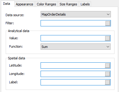 In that case, the application must display the following data:
- spatial data – latitude and longitude;
- label (for example, city name);
- numerical value (for example, sales in a given city).
Let us have a Sales table with the following fields and data:
Latitude Longitude CityName SalesTotal
-------- --------- -------- ---------
48.13641 11.57753 Munchen 50000
50.94165 6.95505 Koln 36000
In that case, the data should be set in the following way:
- data source – Sales
- spatial data, latitude – [Sales.Latitude]
- spatial data, longitude – [Sales.Longitude]
- spatial data, label – [Sales.CityName]
- analytical data, value – [Sales.SalesTotal]
- analytical data, function – “Sum”. This function is used if there are several inscriptions with different values for a given city.
Highlighting the data with the color
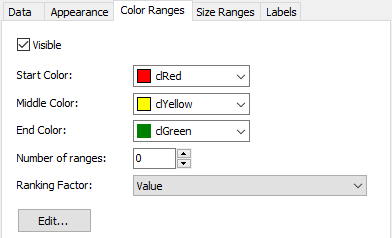
After the layer is connected to data, a question arises – in what form will the analytical information be displayed (for example, sales in various countries)? The easiest way is to set the display of inscriptions so that sales figures are shown next to a country name (see the section “Setting the displayed values”). However, it is much more convenient to paint the countries with certain colors depending on the sales volume. For that, we have to set the color scale in the “Color ranges” tab:
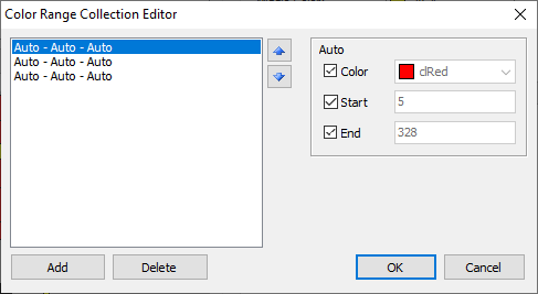
The color scale is a set of values: minimal value; maximal value; color. There may be several such sets (ranges). To set the scale, one should indicate how many ranges it will contain, then set the minimal and maximal values in each range, and set the color:
By default, all values are set as “Auto”. In that case, FastReport will calculate the minimal and maximal values for each range automatically, and take the color from the “Initial color”, “Intermediate color” and “Final color” presets. This mode can be used in most cases. The “Ranging factor” setting changes the distribution of values along the scale.
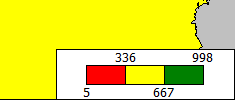
After the color scale is set, an indicator appears in the bottom of the map – a band of several colored rectangles:
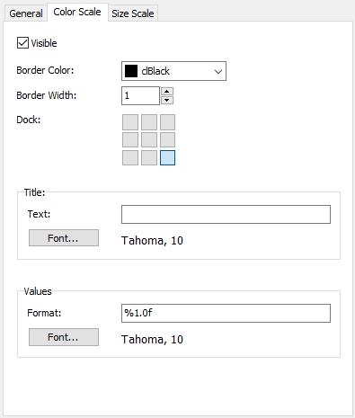
The appearance and position of the indicator can be set by choosing the Map element in the list of layers and switching to the “Color scale” tab:
Highlighting the data with the size
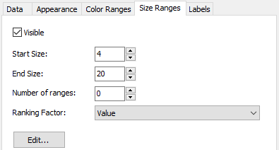
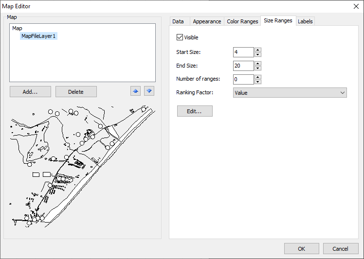
If the layer type is indicated as the app-provided data, then the values will be displayed as a point with an inscription. The point size can be linked with data in about the same way as when highlighting with color. You can do it in the “Size ranges” tab:
The size scale is a set of values: minimal; maximal; size in pixels. There may be several such sets (ranges). To set the scale, one should indicate how many ranges it will contain, then set the minimal and maximal values in each of them, not forgetting about the size.
By default, all values are set as “Auto”. In that case, FastReport will calculate the minimal and maximal values for each range automatically, and take the size from the “Initial size” and “Final size” presets. The “Ranging factor” setting changes the distribution of values along the scale.
How to use interactive maps in FastReport VCL 2021
Interactive maps became very popular after Google Map appeared. These maps allow moving around a map, scale up and down and have many other functions. After FastReport VCL 2021 was launched, such maps can be embedded into reports. For that, you have to get a map in one of the two available formats and embed it into your report with the help of a Map object.
You can use maps in formats .shp and .osm, as well as GPS tacks in .gpx format.
The .shp format is ShapeFile. This is a special format for storing vector geoinformational data. It was developed by an American ESRI company in the 1990s. Today, it is one of the most popular formats used in geoinformational systems.
Actually, ShapeFile is not a single file. Alongside with a .shp file, a set includes also .shx and .dbf files.
The former, .shp, is a geometrical description of shapes. A .shx file has a position index for binding shapes to each other. A .dbf file contains information about the shapes from a .shp file.
As this is a commercial product, some of the maps may be paid.
The .osm format is OpenStreetMap.
This is a format for storing geographical data based on xml. As is clear from the name, it is an open project maintained exclusively by volunteers. This web project is a global map of the Earth. Volunteers constantly add new geolocation data and aerial photographs. The project is very popular and has a lot of participants. Thus, the maps are rather detailed. All maps, both in .osm and in .shp formats are two-dimensional without altitude above sea level.
As the project is free, the maps are also free of charge.
To start with, we need a map. The Map object supports three file formats: .shp, .osm, .gpx.
The former two are vector maps; the latter is a set of routes and tracks for maps. You can download a map in one of the available formats, then the GPS data in a new layer.
Before considering the Map object, let us identify where we can take these maps from. You can download ready-made maps in the Internet. Many websites offer both paid and free maps in both formats.
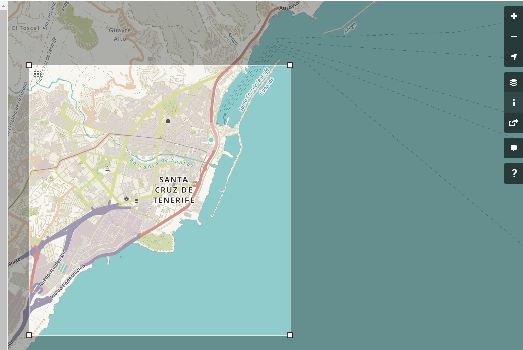
There is another way to get a map file in .osm format. It is a special service – an interactive map of the Earth. This service allows choosing the necessary area and exporting it to a file. However, the size of the exported area is restricted. As a rule, this area contains one settlement or its part. Let us see how it is done:
After you click “Export”, the browser downloads the .osm file. Thus, the service is very useful if you need to show just a small region on the map. If you just wish to experiment, you may take the ready-made PortoSantoTrack.osm and PortoSantoTrack.gpx files from FastReport VCL 2021.
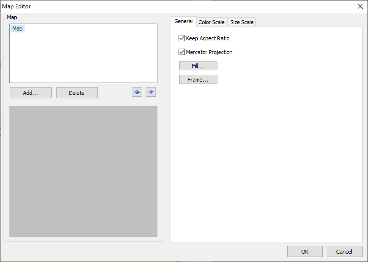
Create a report and add a Map object to the page. By the way, you can place this object in any band except “Data”. After adding the object, we will immediately see its editor.
The object is empty so far. We can see only general settings, color scale, and size scale.
It is important to note that you may display a map in one layer or divide it into several layers.
If you divide a map into several layers, each layer is set separately – color, font, line width, etc. with various settings for separate layers we can, for example, color river in blue and trade routes in red. Map objects are described by tags in an XML (OSM) file. In each layer, we choose the tags (objects) to display. Then, set the parameters (color, font, line width, etc.) in settings. In general, the layer-by-layer map display allows setting the image as you wish.
If you display a map in one layer, settings are enabled for all map objects and you cannot set the displaying of its separate elements.
It should be noted that for the maps in .shp format, only one-layer display is available.
To add a map, click Add…:
A window for adding a layer appears. Choose a file with a map or a GPS track. You may include the file into a report with the relevant option. Below are two more variants of adding a layer:
− empty layer with data from the application – the data for building a map can be taken not only from the file but also from a database. Thus, we create an empty layer and set connection to a data source;
− empty interactive layer – as far as I understood, this function has not been implemented so far. It assumes an opportunity to create a layer manually, with primitives.
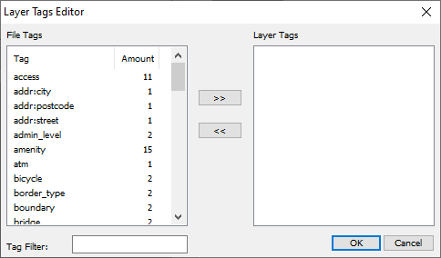
Click OK. If we download a .osm file, we will be offered a window for choosing tags:
Attention! If we click the “Cancel” button, all tags will be automatically chosen for the current layer. But we will do it another way.
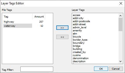
With an arrow button, move tags to the right. If we wish to display the map in several layers, we choose the tags necessary for the current layer. For example, we moved almost all tags to the first layer, except highway and waterway tags:
There is a tag filter in the bottom. Click ОK and get almost the complete map:
In the settings of layer 1 in Appearance tab, choose Point Size equal to 0, so that it does not interfere:
A few words about layer settings. They are shown in five tabs:
- Data – to use geodata from the database;
- Appearance – to set the appearance of lines;
- Color Ranges – to set the colors for automatic shading of objects on the map;
- Size Ranges – to set a size table or a size grid;
- Labels – to set the labels.
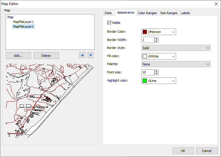
Add one more layer in the same way as before. This time, choose a highway tag. In Appearance tab, change Border Color to Maroon. Now the highways are of maroon color.
Add the third layer. This time we choose a waterway tag. In Border Color, change the color of waterways to blue. Set the Border Width value of 2.
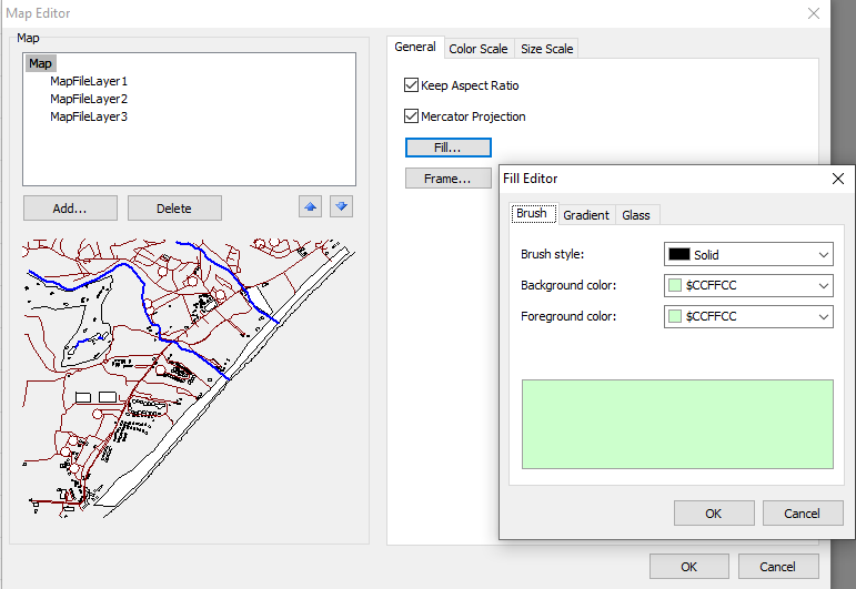
Choose some pastel color for the background shading in Map settings.
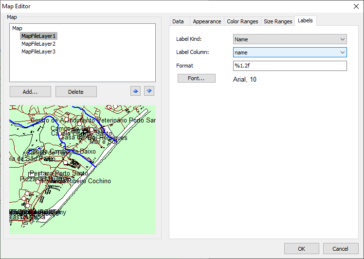
Now we need the names. Choose the first layer. In the last Label tab, choose the Name value for Label Kind and the name value for Label column.
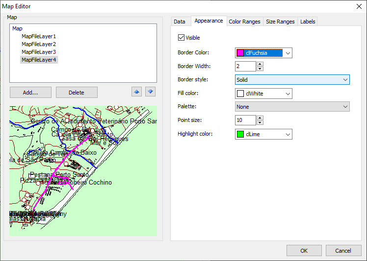
The map is added, now let us see how the GPS track for this map will look like. Add one more layer and choose a file with .gpx extension.
In Appearance tab, choose a bright color for Border Color:
The map is finalized. Now we launch a report.
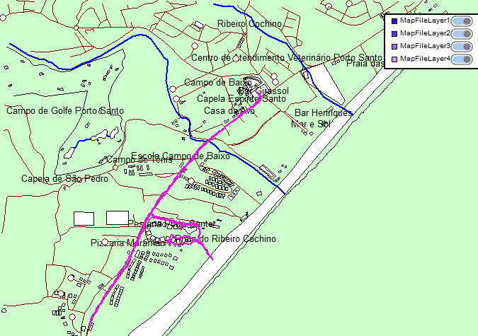
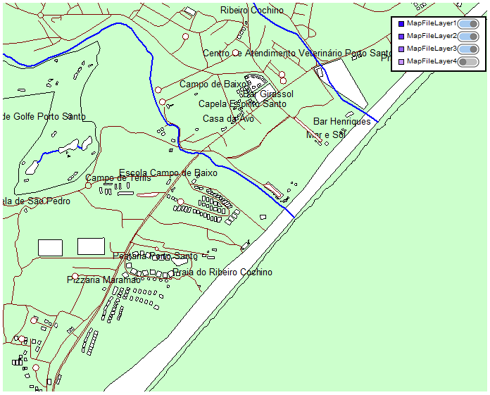
One may clearly see the GSP track of bright pink. We can move around the map with a mouse and scale up and down with a mouse scroll. In the upper right corner there is the filtration block. In it, one can disable the unnecessary layers. For example, we disable the last layer – the track:
There is a problem adding a map by layers. One has to manually add the necessary tags to the layer. But the result is much better than after adding all tags into one layer.
Now, you know about all the basic functions of FastReport VCL 2021. Be creative and make your own great reports. We wish you success on behalf of the Fast Reports company!
