What's new in Windows 11
Windows 11, which was announced in the middle of the year, caused heated discussions and sparked a lot of comments asking “why?”. Microsoft argued that they needed changes because during the pandemic people use more computers to solve everyday and business tasks, surf more, play with friends, make online meetings, video conferences, etc. All this prompted the company to create a new platform to make interaction with a PC more convenient and user-friendly.
We wondered what they wanted to surprise us with because version 10 set a high bar in all respects. It was so important not to make it worse with innovations. Microsoft has paid particular attention to such important areas as improving multitasking when working with multiple windows, improving support for several monitors, and more. Let’s go over each item in detail to form an opinion on whether it has become better or worse.
1. Hardware requirements
From now on, Windows only runs on 64-bit processors and at least 4 GB of RAM. The requirements are not very big and daunting by modern standards, but it is the fact. This means that old technologies are now officially "retiring" - 16-bit programs now can’t be run. Old motherboards that do not support UEFI technology are like old processors a thing of the past.
But the saddest thing is that the list of supported processors is very limited. You can read more at the following link. It turns out that processors older than 4 years are outdated and Windows 11 is becoming a “not for everyone” operating system. With this in mind, it is obvious that Windows 10 will be in harness for a very long time.
2. User interface
First, of course, the user interface has changed. Since Vista, Microsoft focused more on the visual perception of the system. The eleventh version was again a pleasant surprise - new animation, blur and fillet of everything and everyone. Microsoft has borrowed some of the best ideas from other operating systems. As a result, different elements of Windows 11 resemble macOS, Chrome OS, iOS and Android. In particular, the same redesigned Start menu was obviously inspired by Launchpad on macOS and their mobile counterpart.
3. Talking of the Start menu
In this version, it is in the middle. This solution is not for everybody, but it looks unusual. As the programs start, icons are added to the task bar and the Start button is gradually moved to the left. However, you can return it to its usual place. The taskbar itself is permanently docked at the bottom of the screen, and cannot be placed on the side or top of the screen. You cannot resize icons, disable window grouping, and drag and drop program shortcuts to the panel.
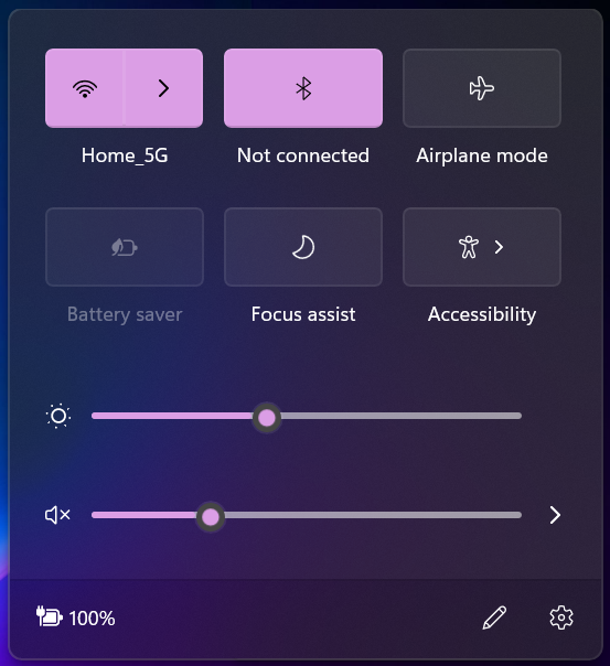
Here is the general window for quick settings. The trend of unification and friendliness of the interface came back in Windows for a long time, but now it is felt very clearly.
4. Split screen mode
You can divide the screen into fixed areas and open applications in each of them. A quick analogy is Android's split screen mode. However, here you have various split templates. To do this, hover the mouse cursor over the window maximize icon:
It turned out to be a very handy feature, especially for large monitors. You don't need to manually scale windows to work with multiple at once. Moreover, you can position application windows as you want and save this layout template for later use. If you have several monitors, then the system will remember the location of the windows for all of them. When you reconnect the monitor, the window positions will be restored. This feature is very useful for those who work with the docking station.
5. Teams chat
Microsoft is promoting its enterprise solution for chatting, video conferencing, file and document sharing. Windows 11 has built-in Teams chat, which was previously a part of the Office 365 office suite. As you remember, Microsoft has a similar application Skype. It seems that it will no longer be developed – all efforts will be hurled into Teams. For many users, this is a dark horse. Perhaps Windows 11 will play a role in popularizing it.
6. Xbox game platform
New Windows offers more options for gamers. The built-in Xbox Game Pass app allows you to connect to XBox gaming service, download games from libraries to your virtual machine, and play. You no longer need advanced video cards to play modern games - only good internet and a paid subscription. Many will find this solution very appealing, given today's prices for computer hardware.
7. OS updates without rebooting
Finally, we are saved from these lengthy update installations on reboots. Now they are installed in the background and, according to the developers, are much smaller. The company decided to move to one major annual update for Windows 11. Windows 10 initially released two big updates a year, but this strategy resulted in serious crashes and bugs.
The start menu now looks more like the Android smartphone desktop:
Shortcuts have replaced tiles. It's even a pity. The trembling tiles that appeared in Windows 8 Phone gave it a personality. The familiar list of applications is also available to everyone in the All apps drop-down menu. We anticipate the discontent of the oldfags.
8. Option menu
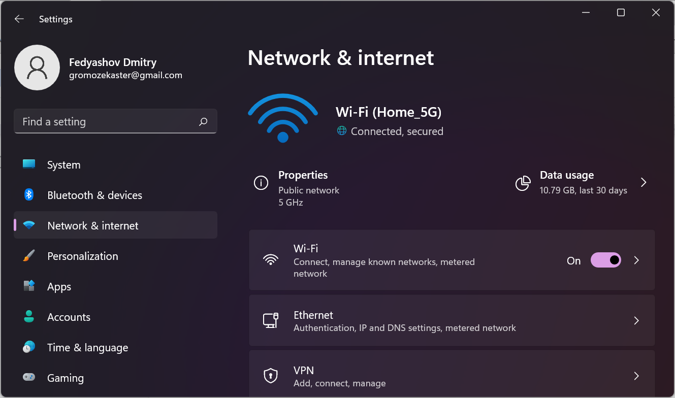
Do you remember the good old Control panel? After all, it is a simple and straightforward solution, especially in the mode of large icons. However, in Windows 10 it was replaced with an alternative tool - the option menu. It was unusual to use it, but it was also inconvenient for some users. In version 11, the design of this menu was changed and it finally became informative and user-friendly. But you can still find the Control Panel app using a quick search on the Start menu.
9. Search
You can launch the search tool from the icon, or simply by starting to type in the Start menu. Search has become more convenient and smarter. You can search in specific directions: in applications, in documents, on the web. It is convenient though.
10. Multitasking
As before, you can open the taskbar using the Win+Tab keyboard. Now you can switch not only between running applications but also between desktops. By the way, for those who like to do everything for themselves, there is much more customization. You can individually customize desktops: theme, wallpaper, shortcuts.
11. Widgets
Such a phenomenon as widgets in a desktop operating system always looked foreign. It is clear that this is a tribute to versatility because Microsoft has been positioning Windows as a multi-platform OS since version 8. Widgets are located in a general window, but they are divided into two groups - application and news. You can manage widgets as before - add, edit, delete, scale and search.
12. Touch control
A lot of work has been done towards adapting the operating system for touch screen control.
- Arrangement of items in menus and windows allows you to use only your fingers.
- Multi-touch for windowing and zooming with multiple fingers.
- Excellent support for stylus, because clicks are accompanied by animation and vibration feedback.
- New and improved on-screen keyboard that is more comfortable and more finger-friendly.
Thus, Windows 11 is targeting the portable device market as well. This time it may work well but past attempts have not been very successful.
13. App store
This functionality also came to Windows from mobile OS. The Microsoft Store interface has become cleaner, which improved usability. In addition, integration with another software platform Amazon AppStore has been added.
An interesting feature of this collaboration is the support for Android applications in Windows. Yes, you can install and use APK apps. In fact, they will run in a virtual machine and the size of the windows will correspond to the resolution of mobile devices. But the very possibility fuels the interest of many potential users of Windows 11. For now, Android applications can only be installed from the Amazon AppStore.
It's also worth mentioning the ability for developers to manage their apps page in the Microsoft Store.
Resume
Windows 11 speaks volumes about its "mobility" - quick settings in a common window, like iOS, split screen mode like in Android, widgets, optimization of the interface for fingers, and stylus control. All this came from mobile operating systems. It's no surprise that Windows 11 is just that. The first attempt to develop a universal multi-platform OS was made in Windows 8. The trend kept on in version 10. Now, we are witnessing the apogee of its development. Moreover, I must say that almost all the innovations were good for Windows - it is pleasant to work with, it is pleasant to look at it, there are many features. But at the same time, Windows is losing its identity. We all understand that this is the merit or fault of marketing.


