How to use Gantt charts in FastReport Business Graphics
An interesting type of charts, the Gantt chart, appeared with the release of FastReport Business Graphics. First of all, it is a popular type of bar charts for displaying plans, schedules of work for any projects. The Gantt chart is one of the project planning methods and is used in project management applications.
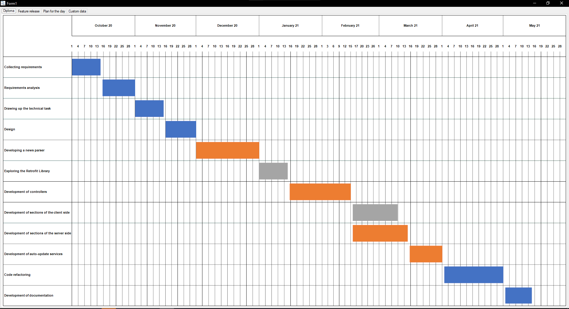
First, let's launch a demo project. This is what the start page looks like when you open the Gantt Chart Demo.
Above, we see the header of the diagram, which shows the period for the development of a conditional project. The list of tasks is shown on the left, and the intervals of performed tasks are in the center.
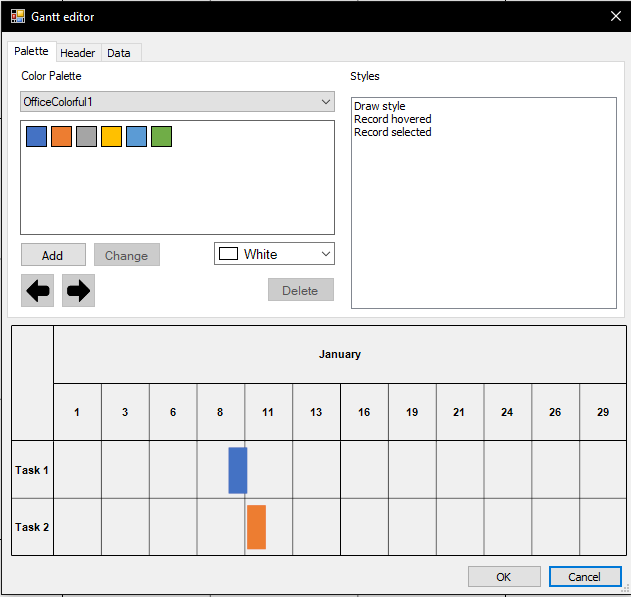
Let’s edit it a little. To go into edit mode, right-click on any string and click Properties, and you will see a window like on the screenshot.
The node is understood as this line, which denotes an action in the project.
Let's start with the Palette. The palette enables you to work with the style of the diagram. Here you can change the color palette and styles.
Color Palette is responsible for the colors of the resources. Here you can choose ready-made templates, or customize them in your own way. To customize the palette, first you need to select a color and click on Add. You may have also noticed an example of how the diagram will look like, which is at the bottom. This is convenient because you don't have to close and open the window to see the changes.
Now let's move on to the Styles window. This is where we can change the strings.
- Draw style is responsible for how the string will look like in normal mode.
- Record hovered is responsible for how the strings will look like when you hover the mouse.
- Record selected is still under development.
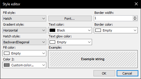
Let's change Record Hovered. To open the editing window, just double-click the left button on the name and you will see the following window:
Fill Style configures the style of nodes during hover.
Gradient style is needed to flexibly customize the display of nodes during hover (only for a gradient).
Hatch style is needed to flexibly customize the display of nodes during hover (only for hatching).
As we can see, style control of nodes is quite flexible. You can change the fill color, gradient style, text color, etc. There is also an example of what the node looks like when you hover the mouse.
For example, let's change the style for a gradient, set two colors, apply changes, and this is how the node looks like when you hover the mouse.
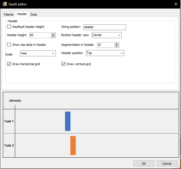
Now let's go to the Header window. Here we can change its height, vertical and horizontal grid in the diagram, a data template, editing the distribution of tasks and the position of the header. This is how the window looks like at the beginning:
Header height is responsible for the height of the header. If you set the Default header height, then the header height will be equal to two nodes.
Scale shows intervals of tasks, depending on which one you have chosen (day, month, year).
String pattern is responsible for the data format that will be shown on the header. The default is MMMM (only month will be shown in the header). C# configures a user-frienfly format. You will have the least amount of problems or mistakes with it.
Draw horizontal grid and Draw vertical grid are responsible for whether there will be horizontal and vertical lines in the diagram.
Show top date in header is responsible for displaying the date depending on your settings in Scale.
Bottom header view shows where the month on the header will be.
Segmentation in header is set up to display days (1 to 31).
Let's change our header. Let's set the following properties:
Now, our diagram looks like this:
Now we have a more precise grid. The month is divided into 10 days and the tasks are evenly distributed.
Let's get to the Data tab, it looks like this:
Here we can create a new resource and tasks, as well as a couple of features. Let's start from the beginning.
In Date, we store tasks. We can delete them, add new tasks, or sort them.
Resources shows resources (often employees). For convenience, you can assign an index to them.
Text on interval is needed to display tasks right on the interval.
Text position is responsible for where the text will be located in the interval.
Maximum width of the block with the title of the record is needed to adjust the length of the task list (leftmost column).
It should be noted that if the value is too small, then the minimum value will be assigned to the property. This is done so that there are no errors in the display if the user makes a mistake.
It is important to know that each resource must have its own unique index. Otherwise, the diagram can work with problems.
You can also add the task name right on the interval. It is enough to check the box in Text on intervals and set the position in the middle. Let's add a new resource and task.
Double-click on the task to add a resource, change the start and end dates and you will see a new window:
To add a resource, you need to write its name below and click on the + button.
We have already created a task in the Data tab, now we create a new resource and click ok. This is what our diagram now looks like:
As we can see, in the lower right corner we have a new interval, which has been in development for a month and has a separate color (yellow) so you wouldn't get all mixed up. The task name will be added to the left of the new interval.
Congratulations, we learned how to edit an existing diagram. Now let's create a diagram.
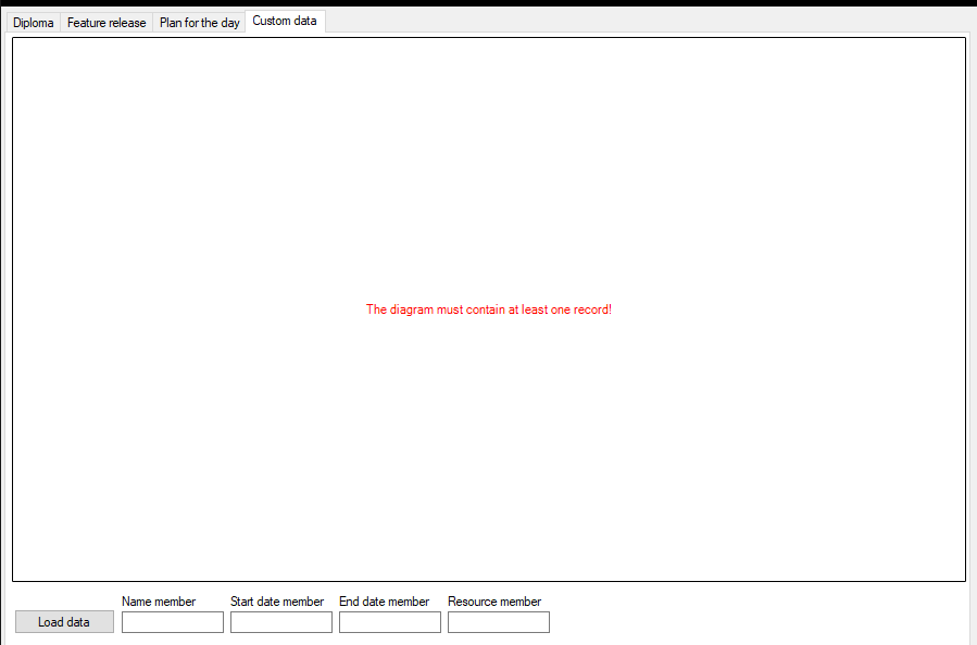
Click on the Custom data tab on the start page, this is what we see when you click the button:
To create your own diagram, first you need to create a .csv or .xml file. Let's take an example of .csv file located at \Demos\Data\GanttSamples. It looks like this:
We have 4 columns, Name, StartDate, EndDate and Index. We enter them one by one:
We get a diagram that looks like this:
Remember that we have only 4 columns.
Name member - contains the name of the tasks.
Start Date member – contains the date when the work with the task started.
End Date member - contains the end date of the task.
Resource member is the name of the resources.
To avoid problems, it is important to keep a check on the names of the columns that you will fill in when creating a chart and the order in which data is entered.
Let’s sum up. This article told in detail how to work with the Gantt chart in FastReport BusinessGraphics. We learned how to change the color and style of the node. We worked with the header of the diagram and figured out how to add new tasks, intervals and resources. Along this, we learned how to create our own diagram using a .csv file.
We wish you good luck using it ;)


