FastReport Business Graphics .NET

Data visualization library for .NET Framework 4.6.2 and .NET 6-8

v. 2025.1.13

With FastReport Business Graphics library you can visualize different hierarchical data, build business diagrams for further analysis and decision-making. All this can work directly in your application!

Features and Benefits Business Graphics .NET
Data
Ability to use hierarchical data from the application, including those prepared in FastCube .NET
Interactivity
When static reports are not enough, the FastReport Business Graphics charts provide excellent interactive opportunities.
Visualization
Helps to make an informed decision with better data visualization.
Integration
A complementary element of the infrastructure: perfect integration with the OLAP operational data analysis library, the FastCube .NET cube.
System.Drawing (GDI+)
The familiar System.Drawing with GDI+ graphics functions is used to create graphical elements, render text, and manage graphic images.
Embeddability in projects
Install the required package from the NuGet repository, or download the package from our website to your computer and add the necessary libraries to the project. No additional modules or special extensions are required.
The Treemap chart

The Treemap chart

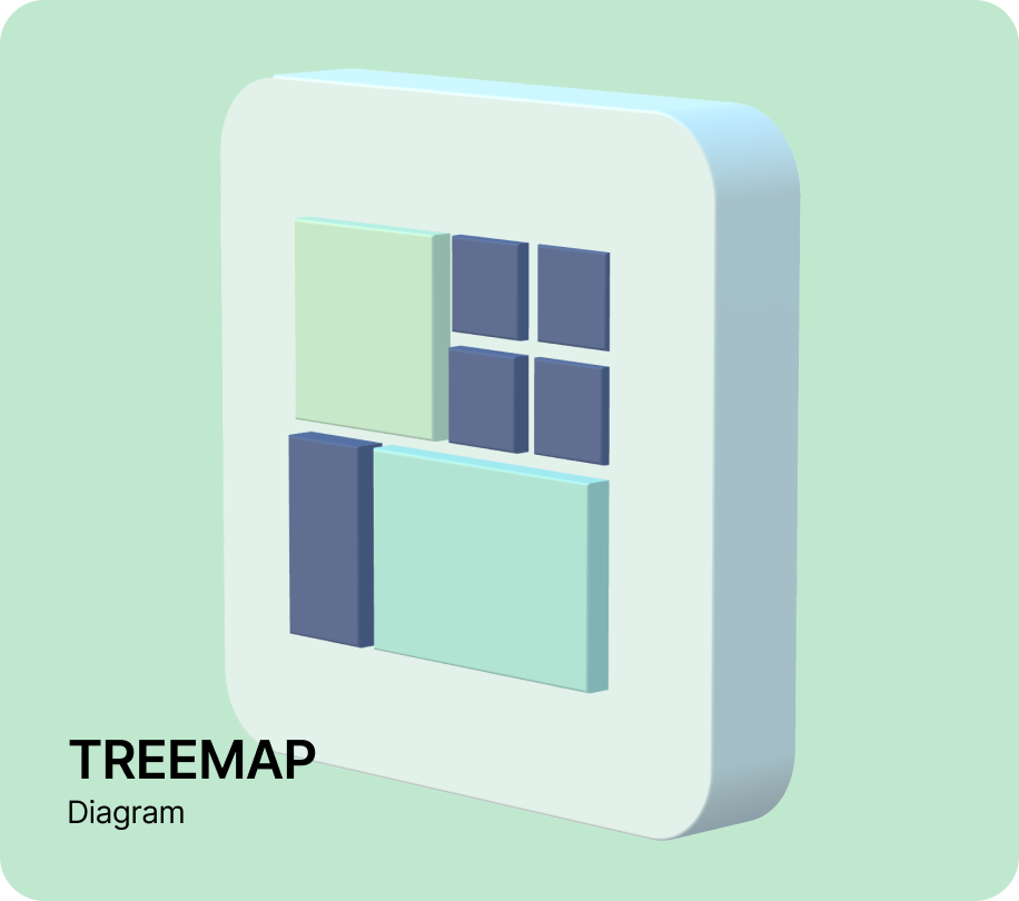
Is a way of visualizing hierarchical data in the form of rectangles whose area is proportional to the value of the displayed record. Within the rectangles of parent records are nested rectangles of child records. This tree chart is suitable for comparing several hierarchies at the same time.
The Bubble chart

The Bubble chart

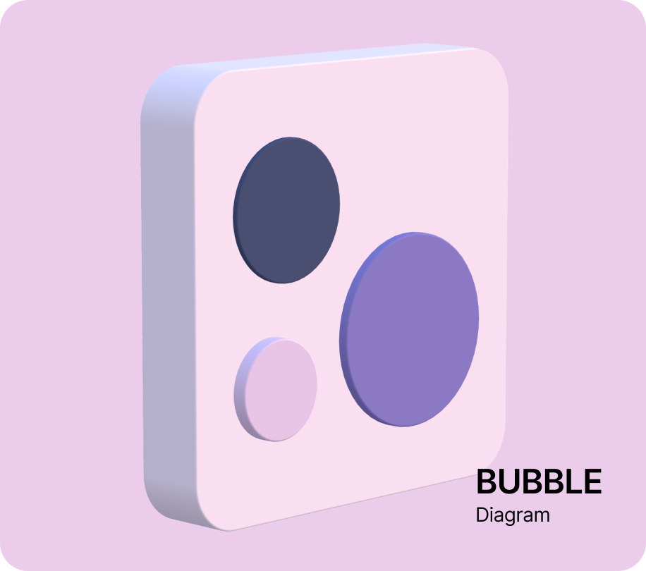
Is a way of visualizing hierarchical data in the form of circles with the area proportional to the value of the displayed record. The circles of child records can be nested inside the circles of parent records. The arrangement of the circles is formed by using a packing program based on the Grokker algorithm, which was modified for a better display of hierarchical data. The Bubble diagram helps to compare several hierarchies that are simultaneously at the same hierarchy level.

The Sunburst chart

The Sunburst chart

Is a sun-like chart with branching rays. The circle in the center is the root node, and the rays that move outward are the children. Each value on the chart occupies an area, the boundaries of which are defined by the start angle and the sweep angle. The larger the value you want to display on the chart, the larger the sweep angle. This chart is suitable for analyzing each level of the hierarchy.

The Icicle chart

The Icicle chart

Presents data based on the hierarchical clustering method. The Icicle chart is easier to read, showing which hierarchy objects belong to and which are children. The large rectangle at the top of the chart represents the root node, whose width depends on the sum of the child nodes. The child nodes are placed below the parent nodes. The chart can also have several drawing directions: down, up, left, and right. An icicle graph is a good way to visualize hierarchical data. The advantages are that it is easy to see the hierarchy, its size, and the level at which it is located. It's also great for examining data relationships.

The Gantt chart

The Gantt chart

Illustrates a work plan/schedule for a project. It consists of two parts: the left part has a list of tasks, and the right part has a timeline with bars that depict the work. The colors for the intervals are allocated according to the resources from the palette. This chart helps to solve one of the main tasks of business process planning and show the staff what to work on, what resources to apply in the process and at what speed to perform certain tasks. Using a Gantt chart makes it much easier to manage small projects.

Ultimate .NET

This set of components is not sold separately, but is included in the Ultimate solution, with which you can create your business projects on all modern platforms.NET, ASP.NET , Blazor, WASM, WPF, WinForms, Avalonia UI, Mono and others. The Ultimate data visualization tool will be complemented by OLAP cubes, source codes and other advanced features

On which platforms is it supported?

Currently, work with WinForms and applications is supported.NET Framework 4.6.2 and higher.

Resent articles

April 06, 2022

What is a Bubble Chart?

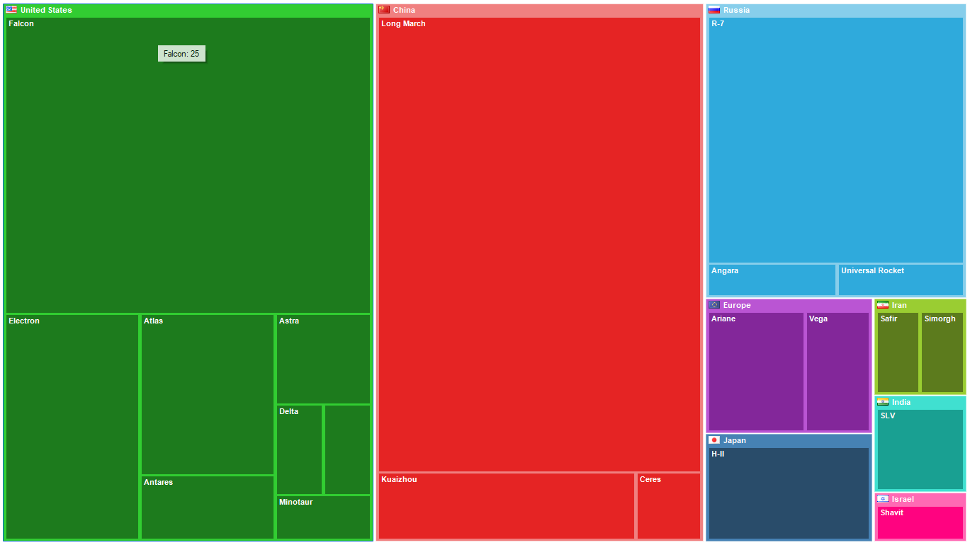
FastReport Business Graphics library contains a set of classes that developers can use in their applications to visualize data and build business charts. In this article, we will explore one of such classes - the Bubble chart. It makes sense to start the Bubble chart overview by comparing it to other similar charts in the FastReport Business Graphics library. The main purpose of all these charts is to show visually the values and levels of hierarchy nesting and allow the user to interactively manipulate the view of the presented data to achieve the desired display option. Such charts are tools for interpreting the data of the Business Intelligence paradigm. The use of these tools can result in a business decision or generate insights for later analysis. First of all, let us try to evaluate the momentary perception of the shape and size of the values when visualized by diagrams from the library set. Below is the same dataset with the number of spacecraft launches and its representation by different charts. Just look at each chart and evaluate your sensations - the comfort of perception and the ability to compare values. TreeMap   Icicle   Sunburst   Bubble   Values are interpreted as the area of the visualized object. It is easier for a person to evaluate objects of circular shape. For example, in the first TreeMap comparison of the areas of rectangles "The United States" and "China" is very difficult because of the different dimensions of height and width. In the Icicle chart, these values are very similar to each other, as well as in the Sunburst chart. In the Bubble chart, these values are noticeably different, and it is immediately clear that the orange circle is a little bit larger. Humans have binocular vision, which helps them estimate the size and distance of objects. This all works well in the three-dimensional world around us, but when using projections on a monitor or piece of paper, binocular vision can play tricks on us. We begin to use concepts such as "eyeballing" and rely on our senses. The size of objects is judged most accurately in the area to which our gaze is directed. Any other objects perceived by peripheral vision do not lend themselves to an accurate assessment of their size. Also important is the visual angle - the shift of the gaze relative to the direction of the head. The distance to the eyes will be different and this will affect the correct estimation of size. Color palette and contrast also play a large role in the correct perception of size. With all these nuances in mind, it is clear that charts must be formed relative to a certain center, to which the human sight will be directed. The most important values (aka the largest in size) should be located in the center of the chart. These objects will be the first to be evaluated by the operator. All these rules are used in the visualization of data by a Bubble chart. Bubble chart capabilities are not limited to comparing a simple list of values. Like the other charts in the FastReport Business Graphics suite, this chart can also visualize hierarchical data as fan-shaped slices of values at one level of the hierarchy. The Bubble chart is interactive. When you hover your cursor over a circle, a tooltip appears with information about the displayed value. By clicking you can select the desired circle. If you double-click, the drill-down operation is executed and the chart displays information about subordinate objects in the hierarchy. Double-click on the current hierarchy area will return the display to the previous level. Captions of objects are displayed in the center of the circle if there are no subordinate objects, or at the top of the circle. If the caption cannot be displayed due to the small size of the free space in the object, the caption is not displayed, but the hint is retained when the cursor is moved. Values of very small values in relation to the parent object are not displayed in the chart. The layout of the circles on the chart is formed automatically by the algorithm. The circles are arranged around the center of the chart in descending order of value. In the program code, you can override the event handlers and perform further actions. There is also an event that helps to customize the display of chart elements. In addition to values that are interpreted as area, there is the possibility to visualize by absolute value. This can be useful for comparing geometric sizes of objects. For example, the diameters of planets. You can read more about the Bubble chart and the data sources in the documentation. Now I propose to briefly consider the algorithm for forming a Bubble chart. The principle of packing circles is based on the Grokker algorithm. Each level of the hierarchy of nested structures works its own instance of the packer. During visualization, the circles are scaled to the desired size. The chart is constructed by adding the first two circles. Then we iteratively add circles to the external closed chain of objects, taking into account the intersection avoidance algorithm. The chain is each time started with the circle closest to the center of the chart. After adding all the objects, a sequence of objects around the initial center will be formed. Later on, the resulting list of coordinates and dimensions will be manipulated to visualize the Bubble chart. When working with the Bubble chart, you should pay special attention to the source data. The number of values at one hierarchy level should not be too large. Otherwise, the perception of the constructed chart can be difficult. You should also apply a preliminary grouping of small values in order to combine them into one value (for example "Others"). When setting the maximum displayed depth property, it is also worth limiting to one or two levels in order to improve the perception of the chart. Before setting the color parameters and properties of a chart, it is always worth remembering the purpose for which the chart is being formed. Color can often simplify the perception of certain values. When selecting a color palette, pay attention to the contrast of color values, you should not combine very saturated colors and faint colors in the same diagram. You should also avoid too dark colors when displaying (printing) a chart on a light background. The same is true for low-contrast colors in relation to the background color. The use of shading in fills can make it difficult to see the dimensions. The Bubble chart has proven to be a simple visualization tool and can be used in applications as one of the Business Intelligence tools as well as other components of the FastReport Business Graphics library. You can see an example of using the diagram in the \Demos\C#\MainDemo folder. I wish everyone a lot of beautiful and useful diagrams!
Read
November 25, 2021

Installing FastReport Business Graphics into FastReport .NET

FastReport Business Graphics is a library containing several advanced means of data visualization. Currently, it contains the Treemap, Sunburst, Icicle charts and the Gantt chart. Today, we will see how to link FastReport Business Graphics .NET to FastReport .NET. It will allow you to use charts from FastReport Business Graphics in your reports. First, you have to install FastReport Business Graphics and FastReport .NET on your computer. Installation of these products is described in our other articles. In the FastReport .NET installation folder there is Extras\Objects\FastReportBGObjects folder. In this folder, open FastReportBGObjects.csproj project. This is a project for building the .dll which we need. Open the list of project references. It will look like this: Delete FastReport, FastReport.BG, and FastReport.Compat from that list. As our goal is to add FastReport Business Graphics to FastReport .NET, we have to add into the project those .dll files which will be used in our work. Instead of the deleted files, add FastReport.dll and FastReport.Compat.dll from the FastReport .NET installation folder, as well as FastReport.BG.dll file, which is in the FastReport Business Graphics root installation folder. After you have substituted the references for the updated ones, build the project. If the building was successful, you are ready to continue to the next step: linking the plug-in to FastReport .NET. The plug-in built .dll file is called FastReportBGObjects.dll and is located in the project subdirectory: Extras\Objects\FastReportBGObjects\bin\Debug You may remove the file into another folder, but then you will have to do it every time you rebuild it. For demonstration, I remove it to the C:\DLL folder. Let us consider two different cases.1) You are using FastReport Designer. In this case you have to link up the dll-library in the Designer and restart it, or indicate its location in the config-file. You may link up the plug-in in the Settings – Plug-ins menu: To add a reference to a plug-in, open the config-file in any text editor and modify it as follows: <?xml version="1.0" encoding="utf-8"?> <Config> ... <Plugins> <Plugin Name="c:\.....\FastReportBGObjects.dll"/> </Plugins> </Config> The path to the plug-in is shown in bold. 2) You are using FastReport as a part of a project. In this case add FastReportBGObjects.dll to the reference list of your project and add the following code to the project code: RegisteredObjects.Add(typeof(SunburstObject), "ReportPage", 125); This code must be executed once. Attention! The FastReportBGObjects.dll and FastReportBG.dll libraries must be additionally located next to the application which uses them. If you use FastReport Designer, copy these libraries to the root folder of the application, and if you use FastReport Buriness Graphics in your project, locate them in the same folder where the executed file is located. Thus, after these steps you may use the advanced charts of FastReport Business Graphics inside the reports generated with FastReport .NET. If you have any questions regarding the FastReportBGObjects plug-in build or linking it to FastReport .NET, please contact our support service. 
Read
Fast Reports
  • 800-985-8986 (English, US)
  • +4930568373928 (German)
  • +55 19 98147-8148 (Portuguese)
  • info@fast-report.com
  • 66 Canal Center Plaza, Ste 505, Alexandria, VA 22314

© 1998-2025 Fast Reports Inc.